Module 2
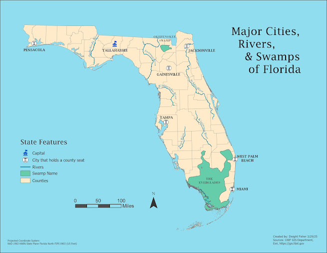
In this lab for module two I was tasked with creating a map layout of Florida with an emphasis on labeling key features that Florida has, such as its major rivers, cities, swamps, lakes etc..
I will begin with describing some of the issues I had while working through this lab assignment and then move onto the areas that I made improvement.
My first issue was what I believe to be user error. I went searching for a polygon shape file that I could load into my GDB folder to use as the basis of my map. After finding it, I attempted to extract the .zip file into my work project folder when at some point I must have inadvertantely moved something vital because immediately after my project no longer had a valid file path.
I eventually ended up deleting the entire project and module folder and starting new.... Multiple times. I ended up losing my patience and stopping for the day to clear my head and to start fresh again at a later point.
The next time I sat down and attempted to work through it I was successful. So began my actual start time for the project.
My second source of confusion was from when I was converting the label classes into an annotation group. When executing the program to convert to Anno, the application was removing the previous annotation layer that I had worked on and replacing it with the newer one.
After hours of trial and error I found what I think to be a remedy which is creating a new "AnnoGroup" instead. Although this does kind of clutter up my content pane I was able to work from the annotation feature class layer for each layer simultaneously.
I am very glad to have the skills from this module because Data labeling and annotation is a HUGE part of creating a solid map layout. I've struggle with other layouts because of the limitations to the annotation editing and labeling tools that I was previously unaware of.
As many people probably do, I took the liberty of really personalizing this map to my preference. I definitely used symbols for point features that I hadn't touched before but I combed through the default picks that come with ARCGIS Pro and settled on some that reflect what I want convey to the viewer in my map.
For instance, For the capital of Florida I chose to symbolize the point with a blue building that has a flag situated on the top of it. That specific symbol is called "Embassy" in the list. While the cities I symbolized with a pillar representing some sore of legislative authority, and then in my legend in the layout, notated that those cities hold a county seat for their respective county.
As I worked through the lab I noticed that the map was very cluttered with all of the data from the different feature layers I had loaded in. As I was skimming through the lab instructions I noticed that on page 7 I read an instruction that stated which features from each feature layer MUST be labeled and symbolized on the final layout.
Then I realized that the goal is to show only a subset of the information that was in each layer.
So the easiest way for me to achieve this was to open the attribute table of each feature layer and to remove the unwanted data.
Keeping the data that I did want made the entire process much easier as I was only working with the subset of data that I intended to visually display.
Customizations
The first
customization I made to my map was adding a pastel off blue color to the entire
layout that would be the base color behind everything else. I chose to do this because firstly
it represents the large bodies of water that surround the state of Florida,
(The gulf and ocean) giving the layout a feeling of calmness and secondly
because it was a very nice contrast to the fill color of the polygon feature
layer for the state of Florida that I chose(a light tan).
The
second customization I made was moving the neat line from the map frame in the
layout to the edge of the layout itself. Because of the dimensions of Florida
being very square it is some what difficult to fit the other map elements
within the layout when you’re working with a square object that has an outline.
Removing this enabled me to position my legend, scale bar, and title around the
state without interference from the map frame’s outline. This was one of my
more favorite changes so far.
The
third customization I made to the layout was converting the legend into a
graphic, which I had never done before, and completely customizing everything
within the legend exactly the way I wanted it to look. Since I began this
course, legends in map layouts have really irked me because of the lack of
control I had over them. Spending the time playing around with the options
available helped me find this and I will probably utilize this feature on every
layout from now on.


Comments
Post a Comment